Personal Logo
Sometimes you just want to design something for yourself, this logo was exactly that.
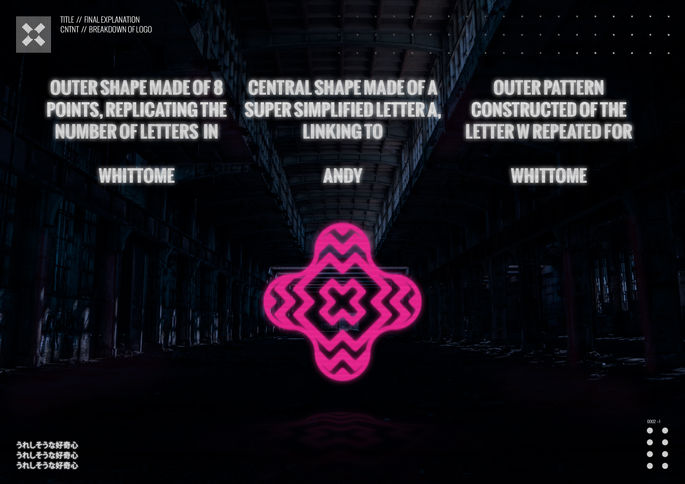
I wanted to create a personal logo that felt more like a mark or stamp than a traditional piece of branding. The goal was for it to be bold and recognisable, but not aggressive, something that could sit comfortably alongside different types of work without trying to steal attention. I deliberately kept it abstract and nondescript, with no clear “right way up,” so it could be used flexibly and still feel balanced from any angle. The layered, symmetrical form gives it a stamped or embossed quality, while the repeated lines create a quiet rhythm that adds personality without over-defining it. It’s a logo made purely for fun, designed to feel solid, adaptable, and just a little bit mysterious.


